Kim’s Master Bathroom Before & After
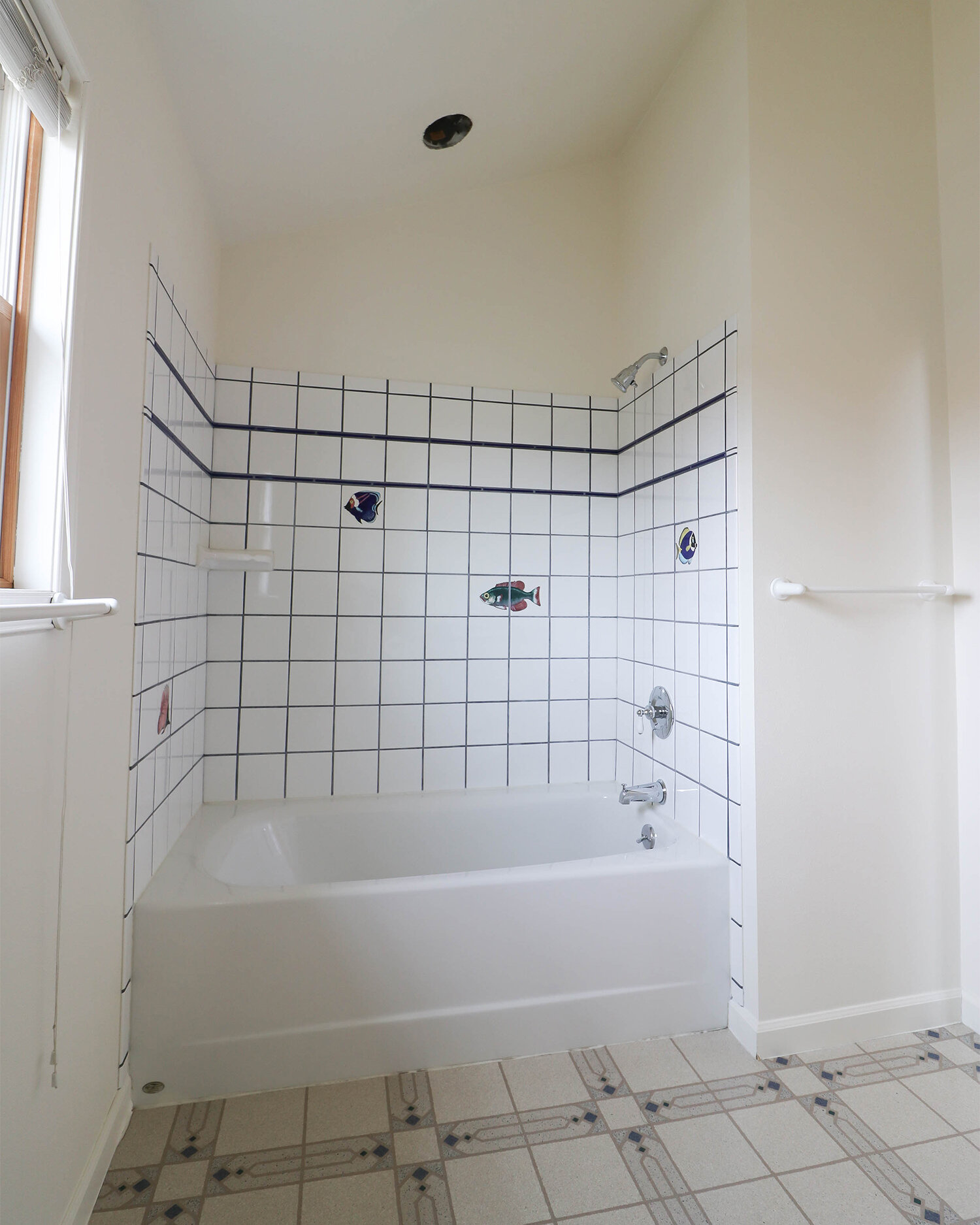
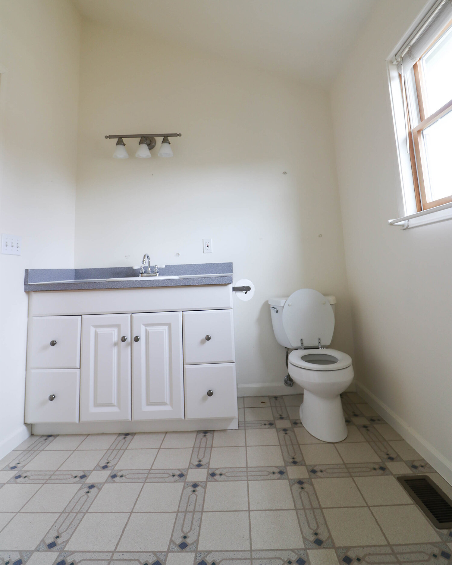
When my husband and I bought our home (almost a year ago today!) we knew the master bathroom would be the first thing to update. Scroll down to see why. Everything in the bathroom is clean and in great shape... it's just clearly not my style.
Master Bath Before
…And now for the reveal!
I don't want to trick you into expecting some dramatic change, haha! We honestly just replaced everything - tile, vanity, counter top, etc. - with modern versions of what was already there. Our bathroom is on the small side so there wasn't much we could do with the layout. My dream of having a vanity with two sinks has been squashed for now.
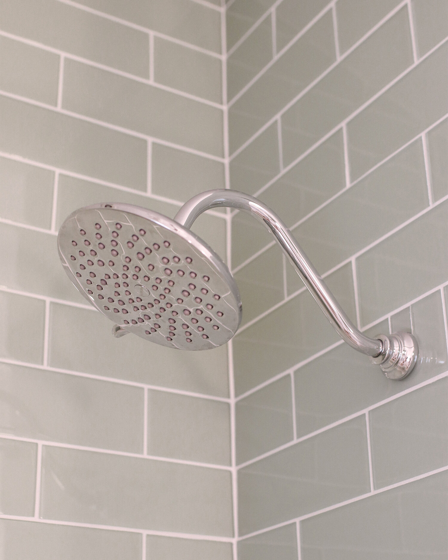
I knew I wanted a clean white bathroom with a soft pop of color. So choosing the vanity and tile was so easy. We went with a white vanity with shaker style cabinets, a quartz countertop that has the look of marble (more affordable and easier to maintain than real marble), porcelain floor tiles that have a marble look (again much more affordable than real marble and easier to maintain), and glass subway tiles in a really pretty sea foam green (these were a major splurge!).
The rest of the design decisions were painfully hard for me to make. Maybe I was overthinking things, as I usually do, I just wanted every design decision and fixture in our bathroom to still look beautiful and be considered modern five years from now. Considering I've never done any interior design/decorating that's kind of a lot of pressure, right?!
I chose light fixtures and faucets in a polished chrome finish to blend with the whites and grays in the floor and countertop. Once the tile, vanity, and fixtures were in place I took a look at the bathroom and had a mini freak out! In my effort to modernize our bathroom I thought I took it too far and things were looking way too contemporary. All the white and silver just felt cold.
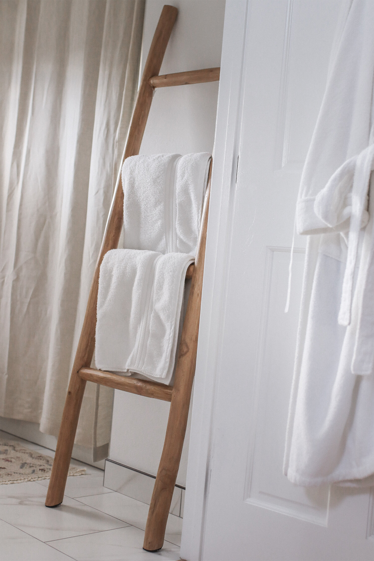
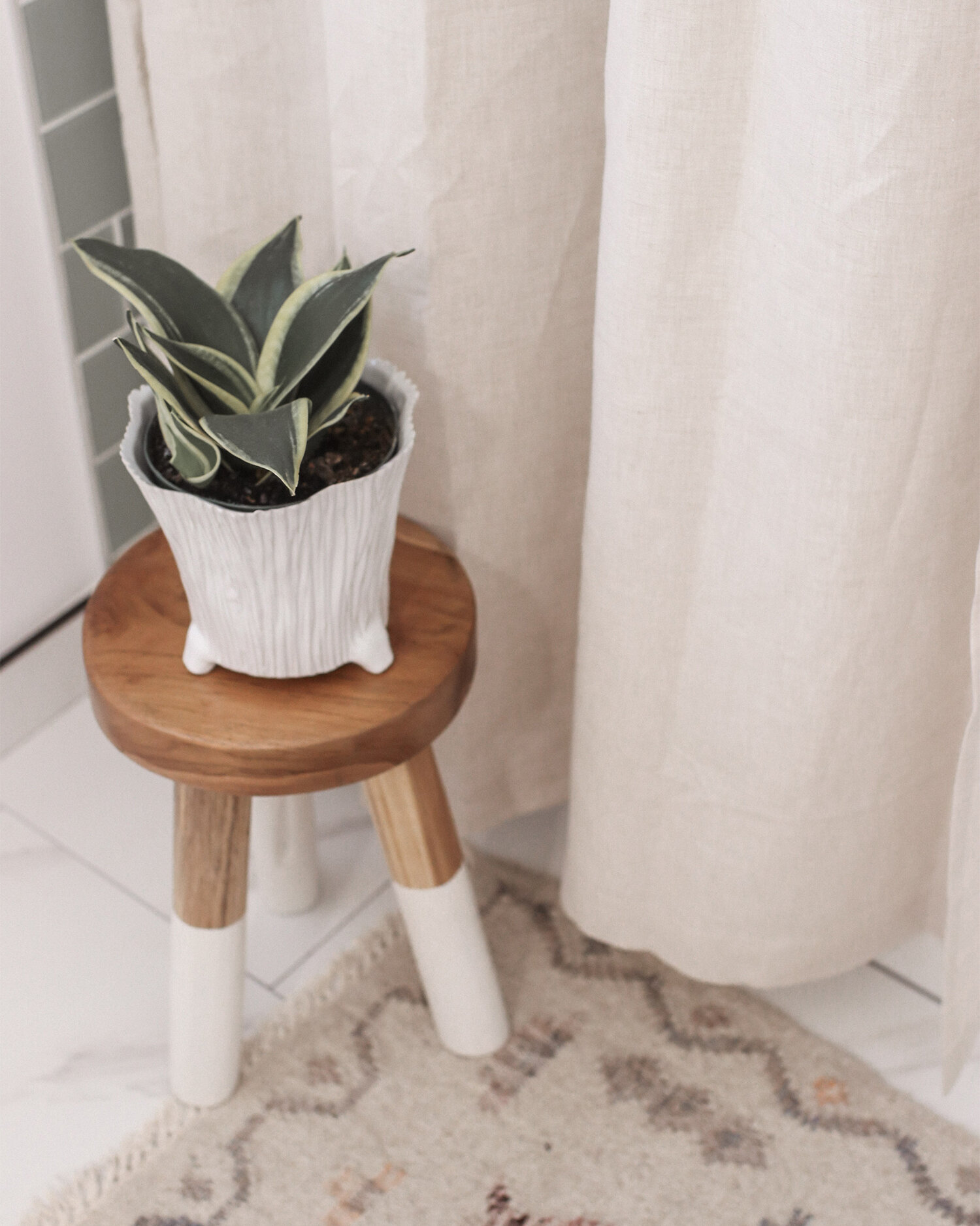
So for the finishing touches, I looked for warm colors and rustic accessories to balance everything out. Starting with the wooden ladder that we have as a towel rack, which you might notice still has the price tag on it! My husband and I can't seem to agree on wether or not it should stay - I love it, but my husband thinks a regular towel holder is more pratical. The wooden stool and snake plant were two other pieces I got to make the room feel more homey - something about house plants just does that, ya know? I also went with oil rubbed bronze drawer pulls on the vanity to break up all the chrome happening on that side of the room. I personally don't like when things are too matchy matchy in a room, it makes me feel like I'm on the floor of a showroom.
There you have it folks! We have our first renovation project under our belt. Up next? The guest bath, then the kitchen. There's so much more I could go into about renovating our bathroom - working with contractors, budgeting for things, etc. but maybe I'll save that for another post? Let me know if that would be something you're interested in hearing about!
SHOP KIM’S BATHROOM
